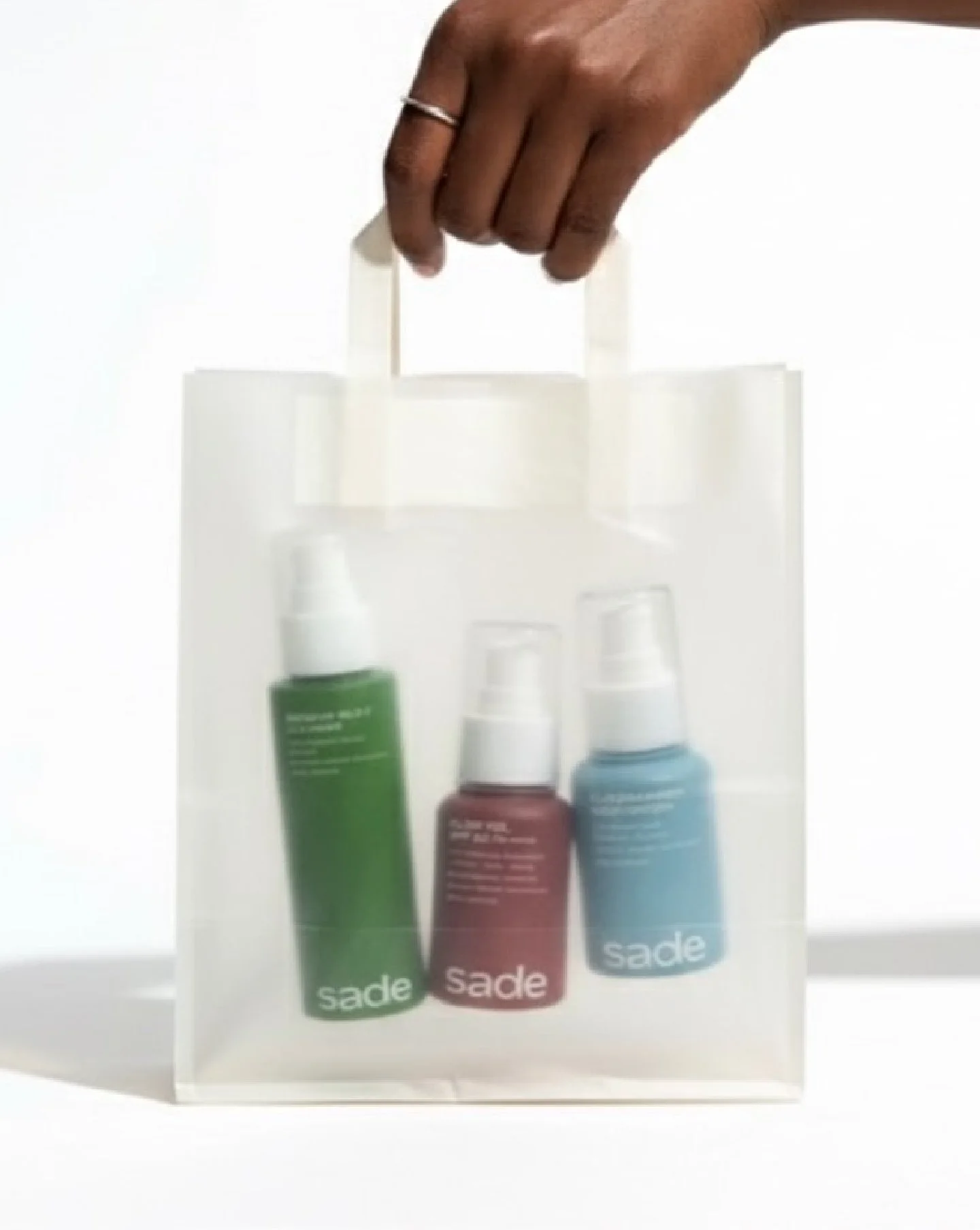
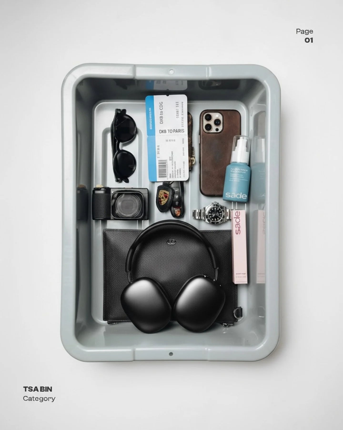
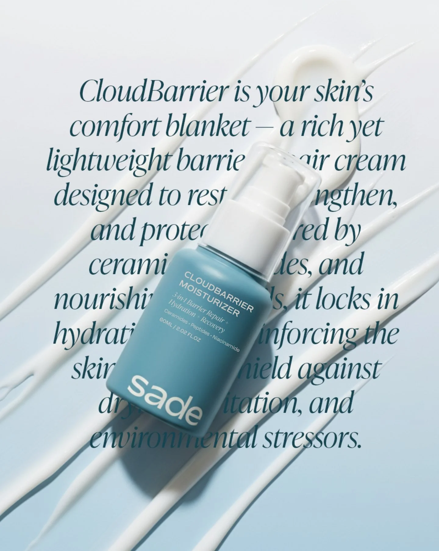
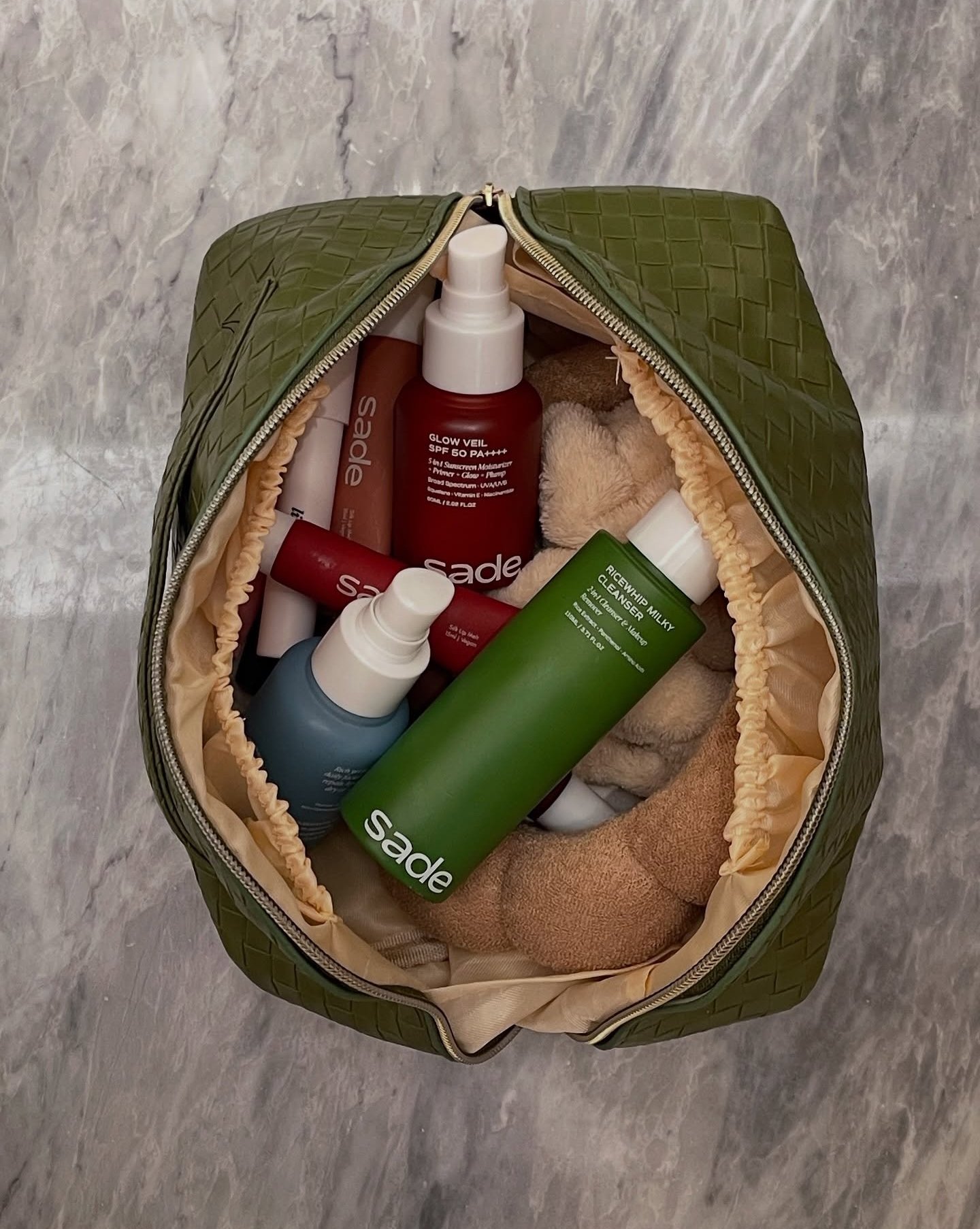
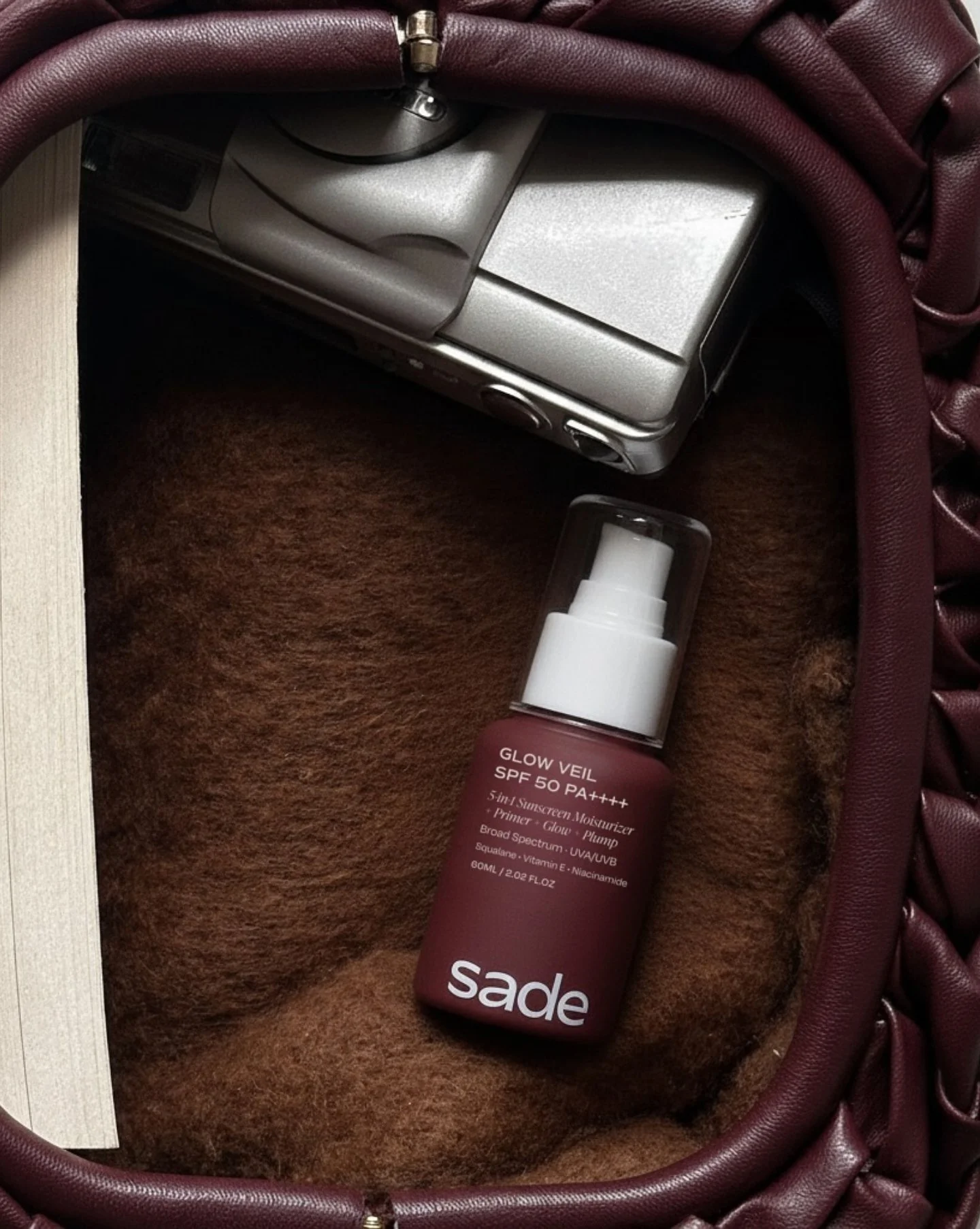
Skincare made simple for modern living. Multifunctional formulas that keep skin balanced in any climate, designed to adapt wherever you are; no clutter, just what works. The final brand direction draws from the versatility of Sade and it’s vision for a simpler and adaptable routine. At the heart of the identity is a fluid logo and brandmark symbolizing the light and sleek qualities of the brand. Soft, rounded edges balance its strength, resulting in a visual language that feels distinctly human. Paired with editorial typography and a refined palette, the identity sits confidently between clinical and cultural, signaling a new era of simple and versatile skincare.
Creative Direction | branding | packaging | photography direction